
Let’s see together all the details for each of these variants. Hopefully, you will find the inspiration you need to embrace such interior vibes into your living spaces, and along with it, insert some beautiful palms for an intense exotic vibe.
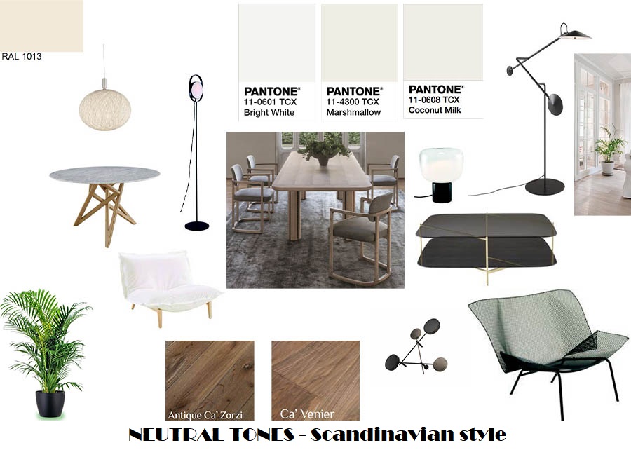
1-1: NEUTRAL – The SCANDINAVIAN look
Let’s give to the entire structure of the house, including openings (doors and windows), a neutral oyster white tone (RAL 1013); another choice would be to play with different intensities of whites, selecting for instance an extra-white for the openings (making them in gloss finish) and a warmer white tone for the walls (choosing here a matt finish). Insert furnishings and flooring in traditional Scandinavian style, meaning in light oak or ash tree. In these interns of neutral tones with lots of light, it will be of a pleasant surprise to find here and there accents of colors, like a black fireplace and a sofa with black feet or the coffee table with black structure, but also a yellow pillow and a big green palm tree near the sofa.
1-2: NEUTRAL - The CONTEMPORARY look
A beautiful palm tree in medium size with its big leaves will make stand out the velvety upholstered sofa in a reseda green color (RAL 6011) and the armchair in the soft velvety fabric of contrast color, like cooper brown (RAL 8004). Place these pieces in ambient with walls in classical boiserie panels painted white. To maintain the scene without distracting the attention, choose a flooring that is neutral, such as a massive parquet in light oak or a travertine in light tines. If you desire to have soft flooring, you can place a monochrome carpet locally or all over the room in silk grey (RAL 7044) or light ivory (RAL 1015) color.

2: WARM TONES – MODERN look on intense and sophisticated GREEN
In this ambient we place the accent on one or more walls painted in an intense moss green color (RAL 6005), selecting pieces o furniture with basic shapes but made in woods of additional value, such as palissander, walnut, and cherry. We can add accents in a warm honey yellow (RAL 1005) like decorative pillows, a painting, some vases, etc. The rest of the walls we will keep neutral but not wishing to create a harsh detachment, I would suggest choosing rather a silk grey tint (RAL 7044) than going for pure white. The flooring will confer additional beauty (and increase the estate value) if placing a marble; my favorites would be here Brèche du Bénou because of the multicolored tones of yellow, green, and pink, but also Bernese with a black background and intense veining in golden and white. Otherwise, laying a massive parquet in a warm tinted wood will be a great option, such as the red maple tree, ash tree, and black cherry. An economic alternative, but adequate for a modern interior, will be inserting ceramic tiles. Openings (doors and windows) will look modern in black matt finish or bronzed brass. To add a pinch of femininity, I would go for curtains in cotton or velvet fabric in light pink (RAL 3015) plus some other decorative objects (vases, sculptures, paintings, lighting appliances).

3: COLD TONES – MODERN look on intense and sophisticated BLUE
We change the background, this time painting all walls in an intense deep cobalt blue (RAL 5013) and inserting furnishings in deep tonewoods, like a classical oak tint wengé, or more exotic and sophisticated Zebrano and Ebony. This will create an introverted mood, cool and calm, perfect for relaxation and retreat. To soften up the ambient, we can insert some coverings in pastel blue (RAL 5024) and agate grey (RAL 7038) for the sofa or the armchair, but also could be the choice for some decorative objects like pillows, vases, carpet, curtains. We can maintain the openings in dark tones (matt back) or we can choose to create a contrast and make them stand out by choosing a light tone (glossy white). To complete the look, we can add lighting in golden or brass finish, and lay on the floor a beautiful parquet in warm woods, such a natural oak, walnut, or cherry. It always remains the option for marble flooring – beautiful and of extra value, in this case selecting among Bardiglio Nuvolato (grey tones), Rosso Levanto (red tones) o Emperador Dark (brown tones).

What color scheme is your favorite? Share it in the comments.
In the meantime, I wish you a great week ahead!
Your interior designer from the other side of the monitor,
Nadiya
MetropolitanMe Blogger